Project Type – Brand, Logo, Menu Design
Role – Graphic Designer
Software – Adobe Illustrator, Adobe InDesign
Skills – Typography, Layout, Hierarchy
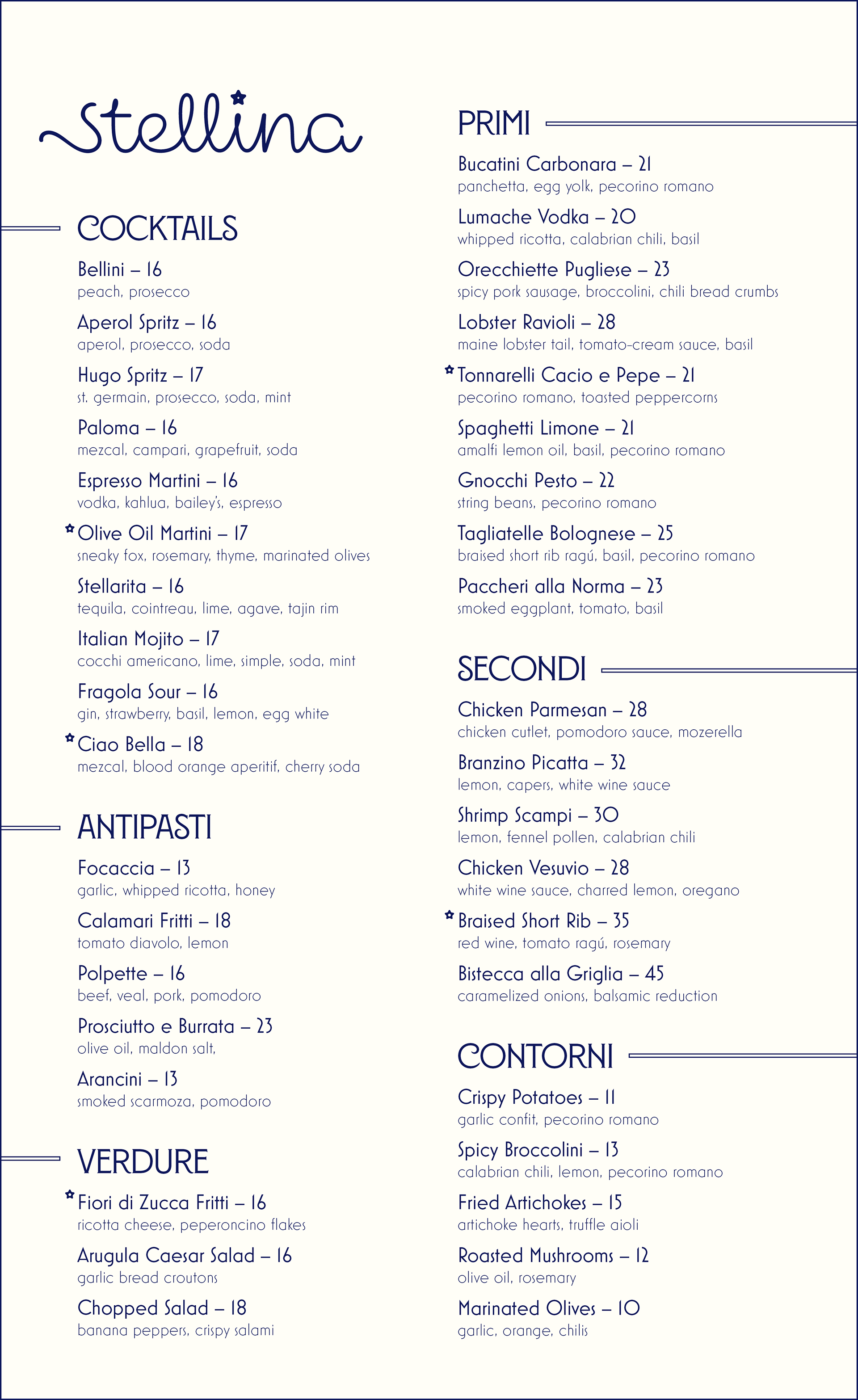
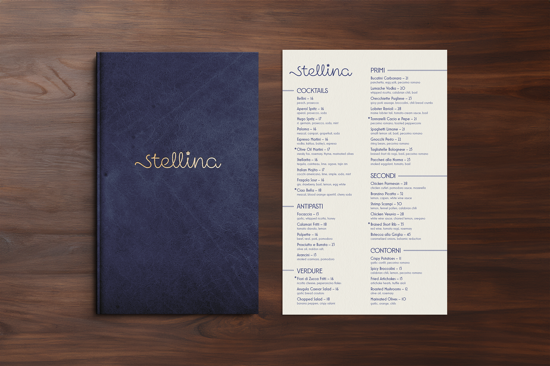
Stellina is fictional restaurant concept that serves Italian food with a modern twist. I picked the offerings for each course by imagining my dream menu. Every item is something I would be happy to order. I chose to name the restaurant Stellina because it means "little star" in Italian and is the diminutive of the name Stella. Stelline (singular stellina) is also a type of small, star-shaped pasta that has a hole in the middle.
I started the project by first developing a logo for the restaurant. I knew I wanted to pick a script typeface and use no capitalization to keep a feeling of playfulness. After browsing, I decided to use Mielle CF but with a few modifications. I adjusted the "S" so that it was more legible and I replaced the tittle of the "I" with a symbol that looks like stelline pasta. I also adjusted the tracking so the cursive letters flowed smoothly and lengthened the bar on the "E" for increased legibility as well.
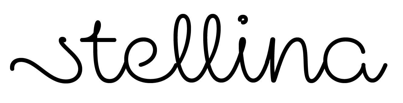
Before customization
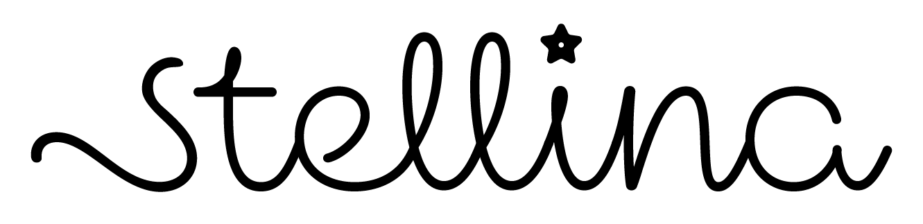
Final logo after customization
While browsing through typefaces, I found that I liked Montecatini Pro, an Art Nouveau-inspired, serif typeface. I thought the curls on the letters "C" and "S", as well as the slight waviness on the "N" and "R", matched the playfulness of the logotype. Because this typeface is only available in capital letters, I decided to use it for the section headings at a medium weight to develop hierarchy on the page. For the menu items and the descriptions, I decided to use one typeface for consistency. I chose Mostra Nuova because of the roundness of its bowls and also the unique narrow "S" that compliments the narrow "S" in the logo as well. I used a lighter weight and lowercase letters for the descriptions to draw more attention to the item names. To further reinforce the hierarchy, I added rules to divide each heading.
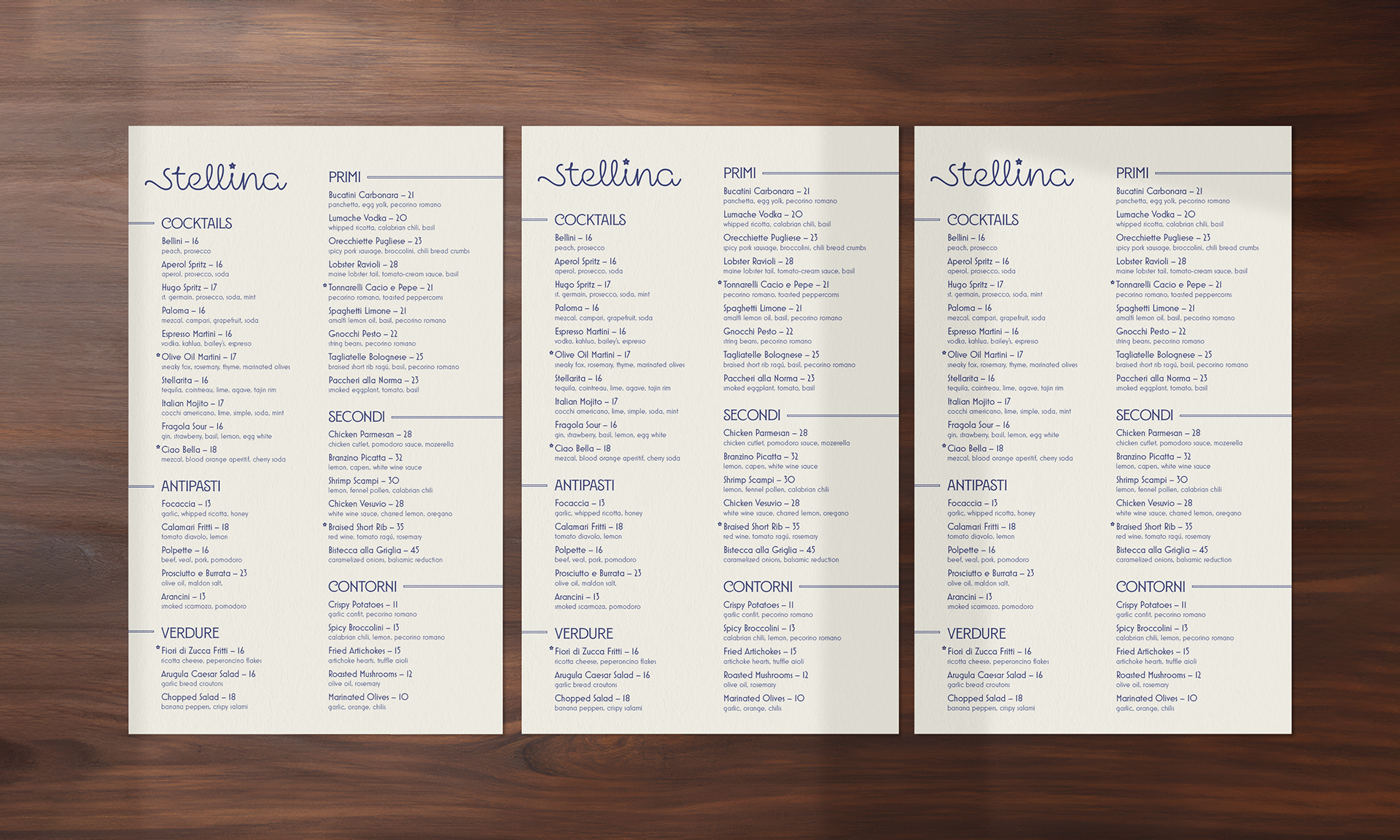
I liked the idea of having all the main menu items on one page to make scanning the options easier. With everything clearly laid out in front of them, the customer can more easily make a decision. I also chose to include cocktails on the actual menu rather than including them in the wine book or on a separate sheet. Again, this helps ease decision making and emphasizes that cocktails can be their own course. When deciding on color, I opted to use a dark navy color for the text, similar to the night sky, and a cream colored paper. For items that can embossed, such as the wine book cover, I chose gold foil since it is bright and shiny like stars.