Project Type – Packaging, Brand, Logo Design
Role – Graphic Designer
Software – Adobe Illustrator
Skills – Designing for a 3-dimensional surface, Illustration, copywriting
The goal of this project was to create a new take on a classic board game. I chose to create a version of Chutes and Ladders that would be geared toward young adults, aged 21 and up. I knew that there were card drinking games available for sale, but I had not encountered drinking board games. For this reason, I thought a game like this would appeal to the demographic. Like in the original game, players spin the spinner and move their piece the corresponding amount of spaces, with the intention of reaching spot one hundred. Along the way, players encounter chutes that bring them down the board and ladders that bring them up. However, in this version, when players go down chutes or up ladders, they draw cards from the respective piles. When one gets a chute card, there will be a scenario on the card and an amount to drink, such as one sip. Oppositely, when one gets a ladder card, the other players drink. Although the game is intended to be played with alcohol, it is not required. One could drink any beverage.
The game pieces consist of a box, game board, instruction sheet, cards, playing pawns, and a spinner. For the design of this game, I chose a color palette that I felt represented a night out. I wanted the game to appear fun and appealing without looking childish, and to also evoke a nighttime setting for drinking. I chose a dark navy background with red-violet and blue-violet accent colors. For the type, I selected the typeface MVB Grenadine, which was designed to look like hand-lettering in children's books. Selecting this typeface helped maintain the connection between this game and the original without appearing too youthful. Additionally, I chose to keep the display copy lowercase, for a playful appearance. I wrote the copy on the cards myself.
Box Front
Box Back
I began the design with the game board. I chose to keep the design relatively simple and in line with the original game. After creating the slides and ladders, I decided to take those elements and create the packaging. I placed them on the front of the box in a way that I felt was playful and dynamic. From there, I decided that the cover needed another element and created shot glasses with lime slices. I repeated the shot glasses on the sides of the box as well. For the back of the box, I chose to include information about game play and images of the board and cards. This way, one would know what is included in the game. I also included a warning about drinking responsibly. The instruction sheet back is similar to the front of the box and the back includes the informational text.
Board
Instruction Sheet Front
Instruction Sheet Back
For the cards, I kept the chutes pack the blue-violet color and used a curvy pattern to represent the chutes. For the ladder cards, I kept the red-violet color and created a grid pattern that is reminiscent of ladder rungs. The game pawns in Chutes and Ladders are traditionally children or children's characters. I decided to move away from that and wanted to see beverages represented on the board. I decided to make the pawns popular cocktails, such as the Margarita, Cosmopolitan, and Aperol Spritz.
Chute Cards
Ladder Cards
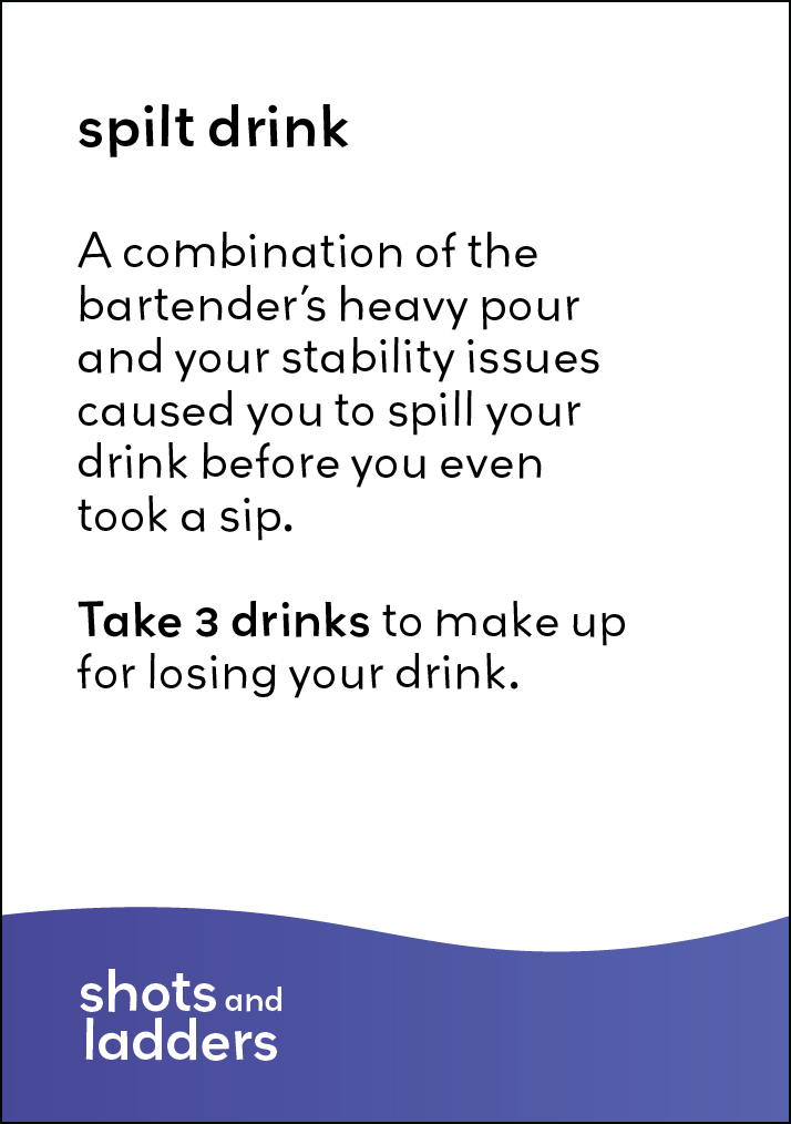
Chute Card Back

Chute Card Back
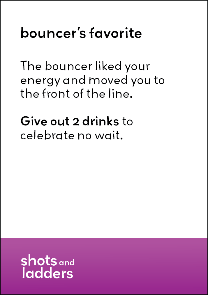
Ladder Card Front

Ladder Card Back

Aperol Spritz Pawn

Cosmopolitan Pawn

Tequila Sunrise Pawn

Piña Colada Pawn

Margarita Pawn

Blue Hawaiian Pawn
Spinner
