Project Type – Brand, Print
Role – Graphic Designer
Software – Adobe Illustrator
Skills – Branding, Typography
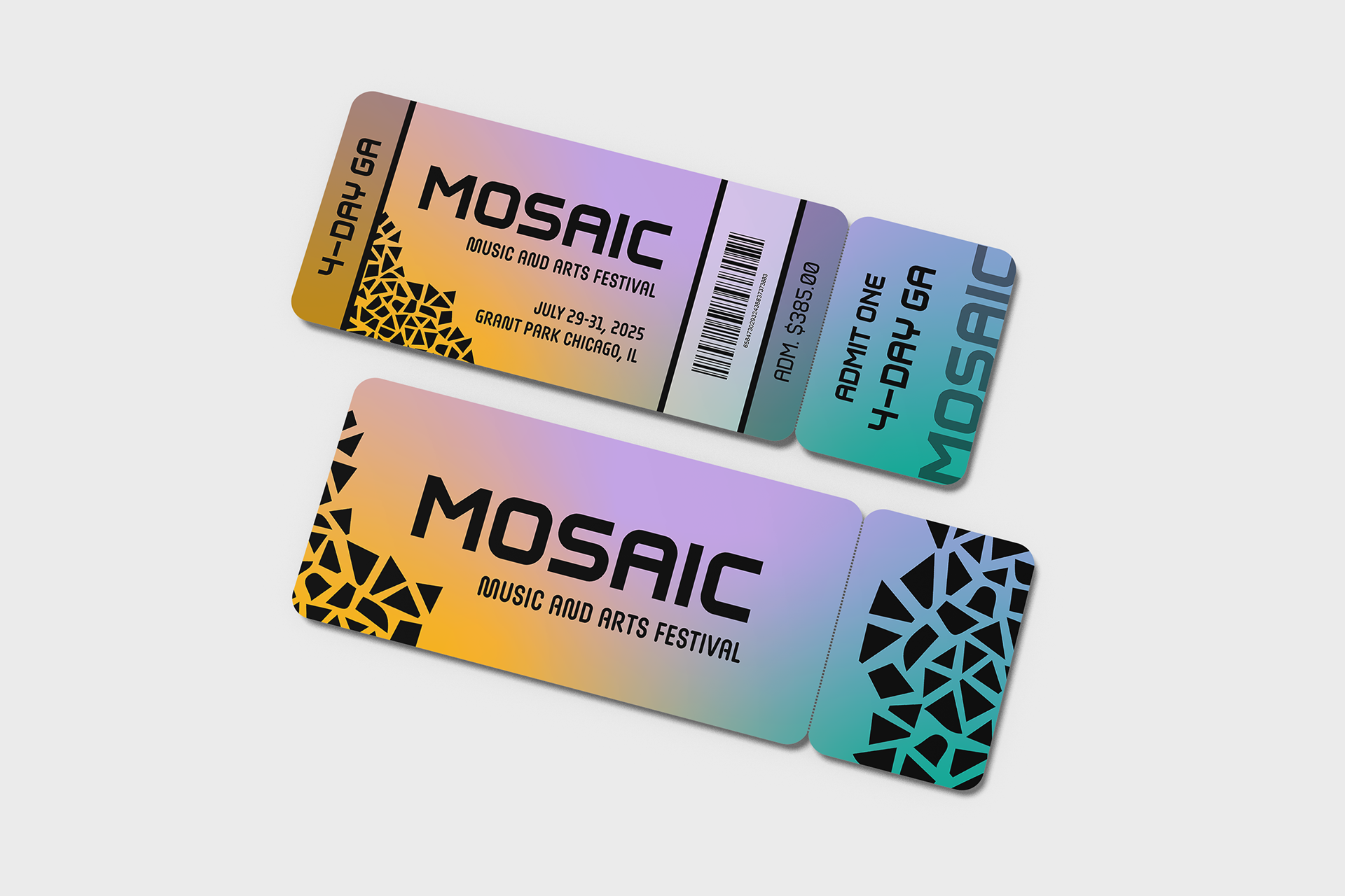
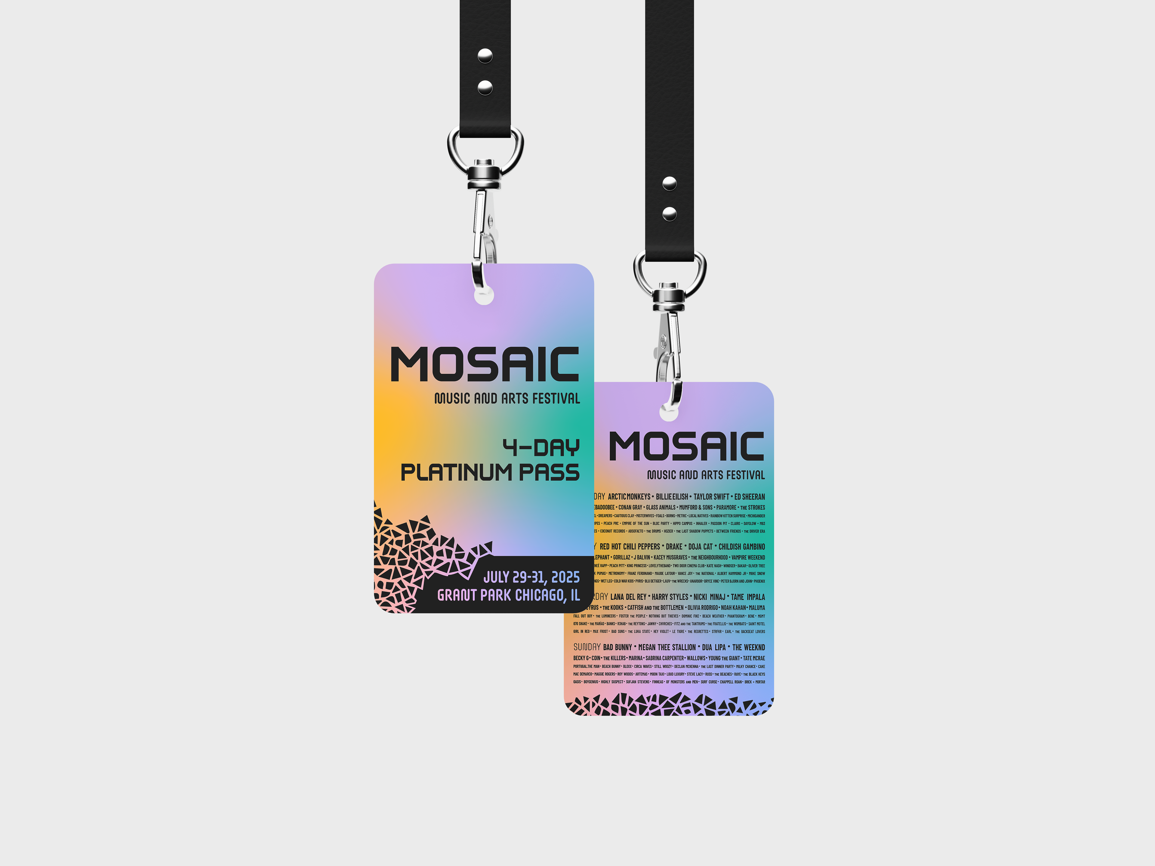
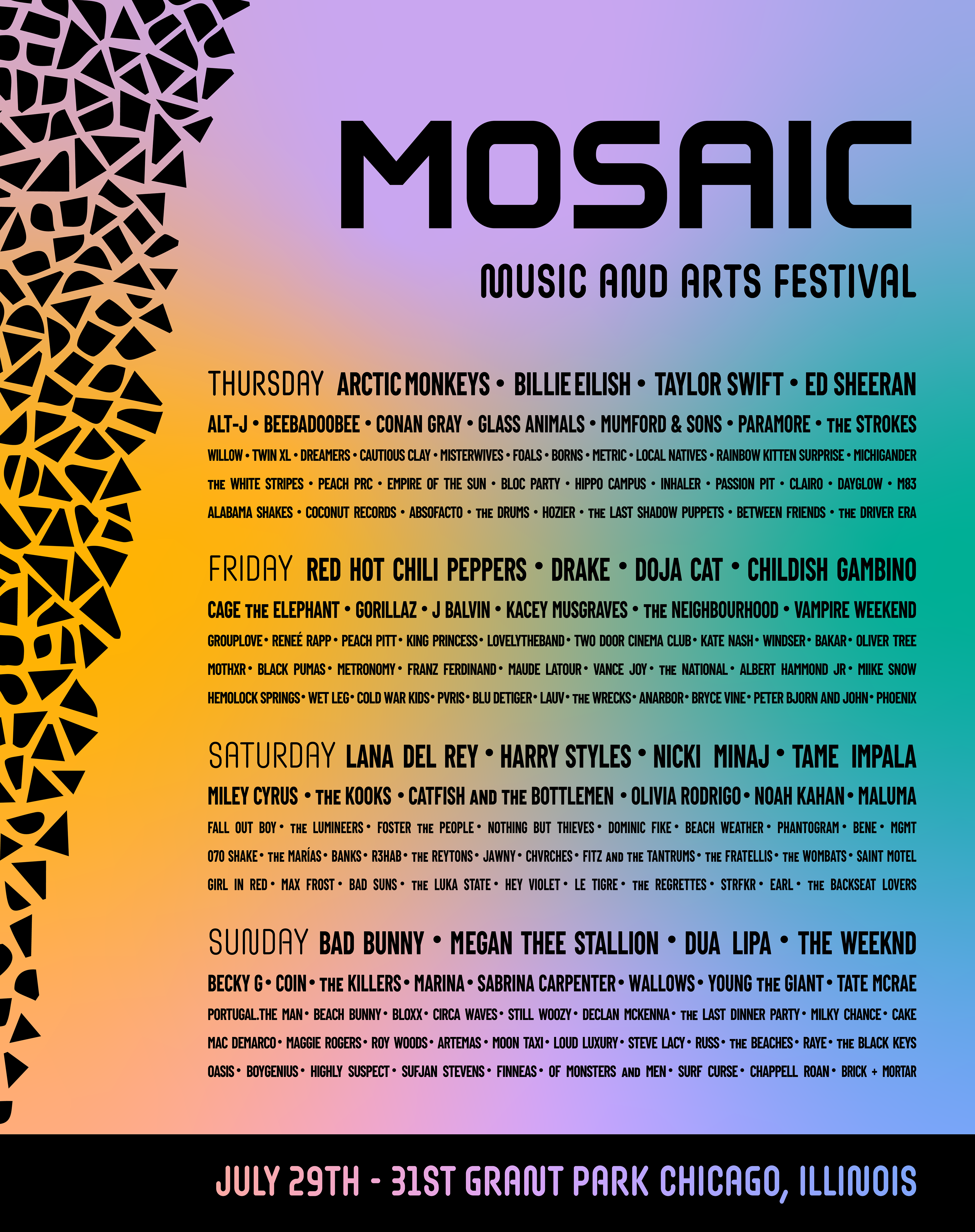
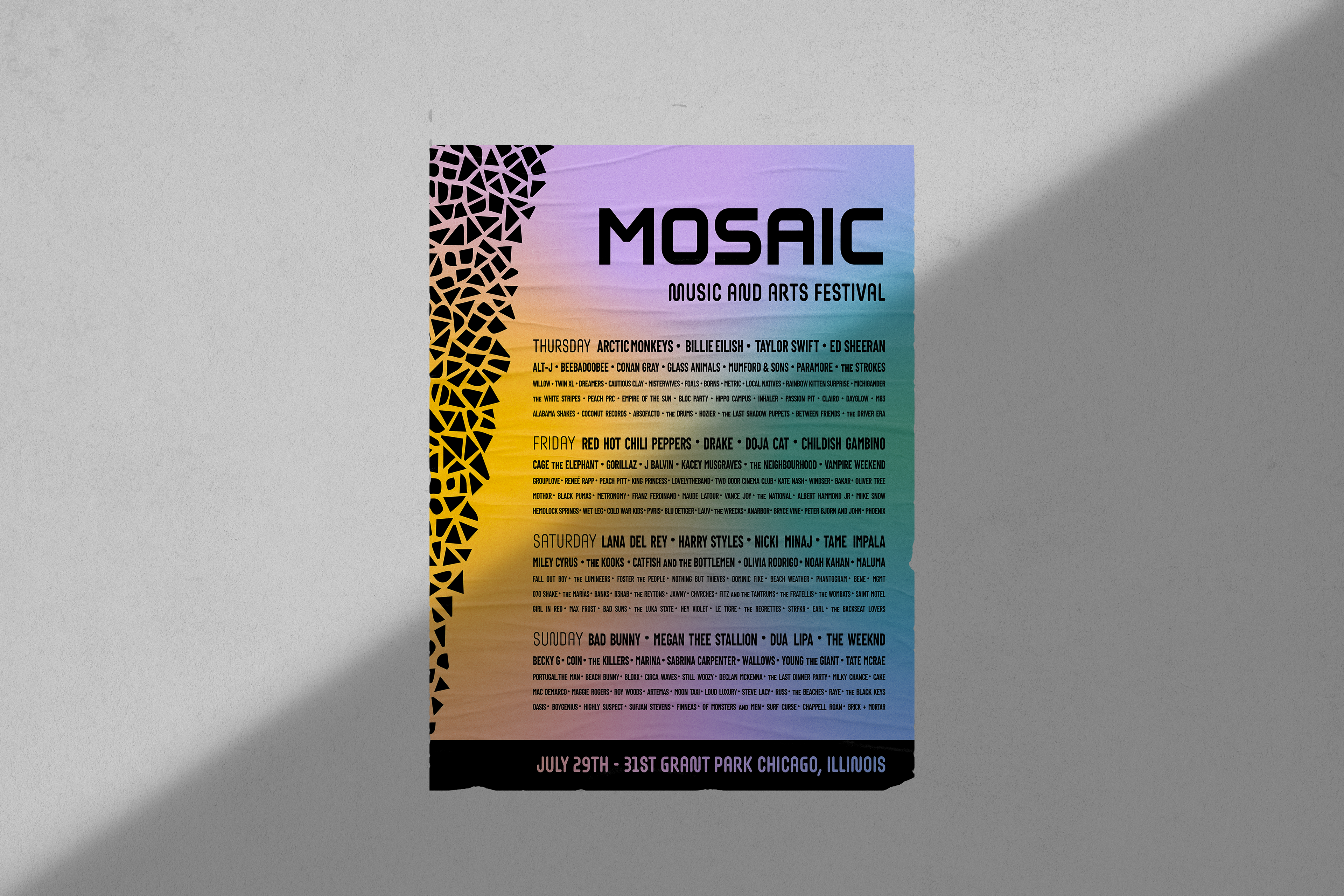
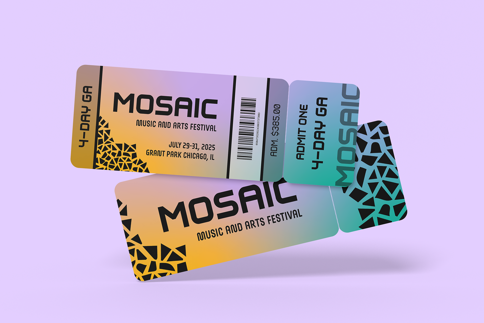
Mosaic is a fictional music and arts festival based in Chicago, Illinois. The name Mosaic was selected based on the idea that this is a seemingly random assortment of artists spanning multiple genres and sounds, but comes together to make something beautiful, like the bits of glass or stone that make up a mosaic. For this concept, I chose to focus on finding strong typography that was both playful and edgy. I also developed a pattern of geometric shapes that resemble the pieces of a mosaic. I selected the primary typeface because I felt its sharp, geometric, and slightly futuristic properties paired well with the angles of the pattern shapes and felt appropriate for the setting. I chose the secondary typeface because its curvy properties reminded me of sound waves which ties back to the idea of music. I chose to keep the typography and the pattern black for high contrast with the colorful gradient background. The colors in the gradient were selected to represent the vibrant and energetic feel of the festival. The deliverables for this project included paper tickets, lanyards, and a poster.