Project Type – UI/UX, Interactive, Web Design
Role – UI Designer, Copywriters: Alex Rodriguez & Sarah Meyer Hughes, Developer: Francesca Morgan
Software – Figma
Skills – Prototyping, Wireframing, Visual Design
I started this project by evaluating the previous RHA website. I identified the following issues. The old website was dark; had harsh and outdated shadows, gradients, and buttons; and had legibility issues with all caps text and visual vibration from placing red text against a deep gray background.
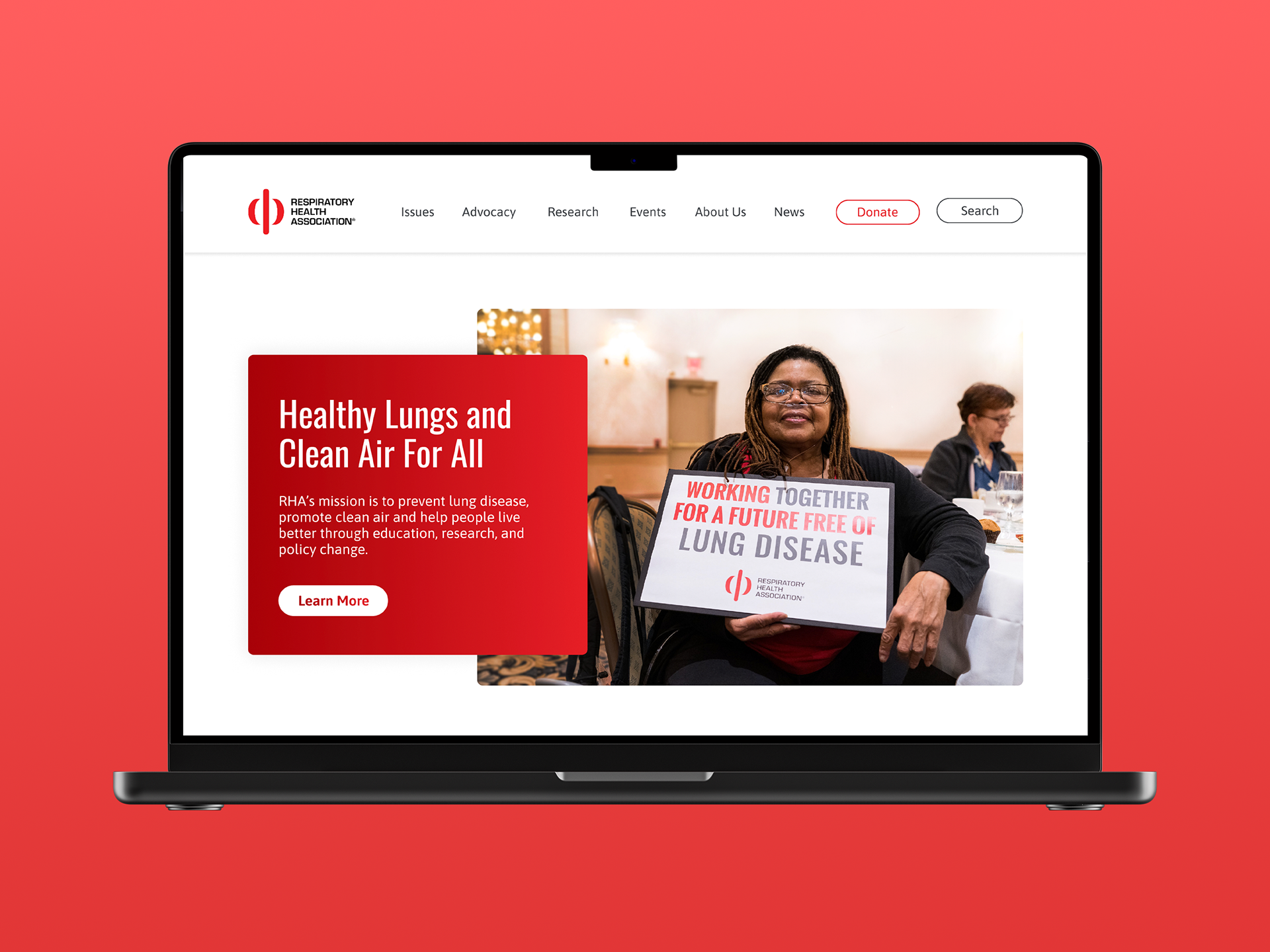
Next, I came up with goals for the new website. I wanted the new website to feel bright and clean; use red sparingly and with intention, left align text for better legibility; use modern shadows, gradients, and buttons; and create a website that felt professional and authoritative.
From there, I looked at what other health non-profits were doing with their websites and made a moodboard for inspiration. After that, I created wireframes to get a basic idea of how all the necessary elements could be laid out on the home page.
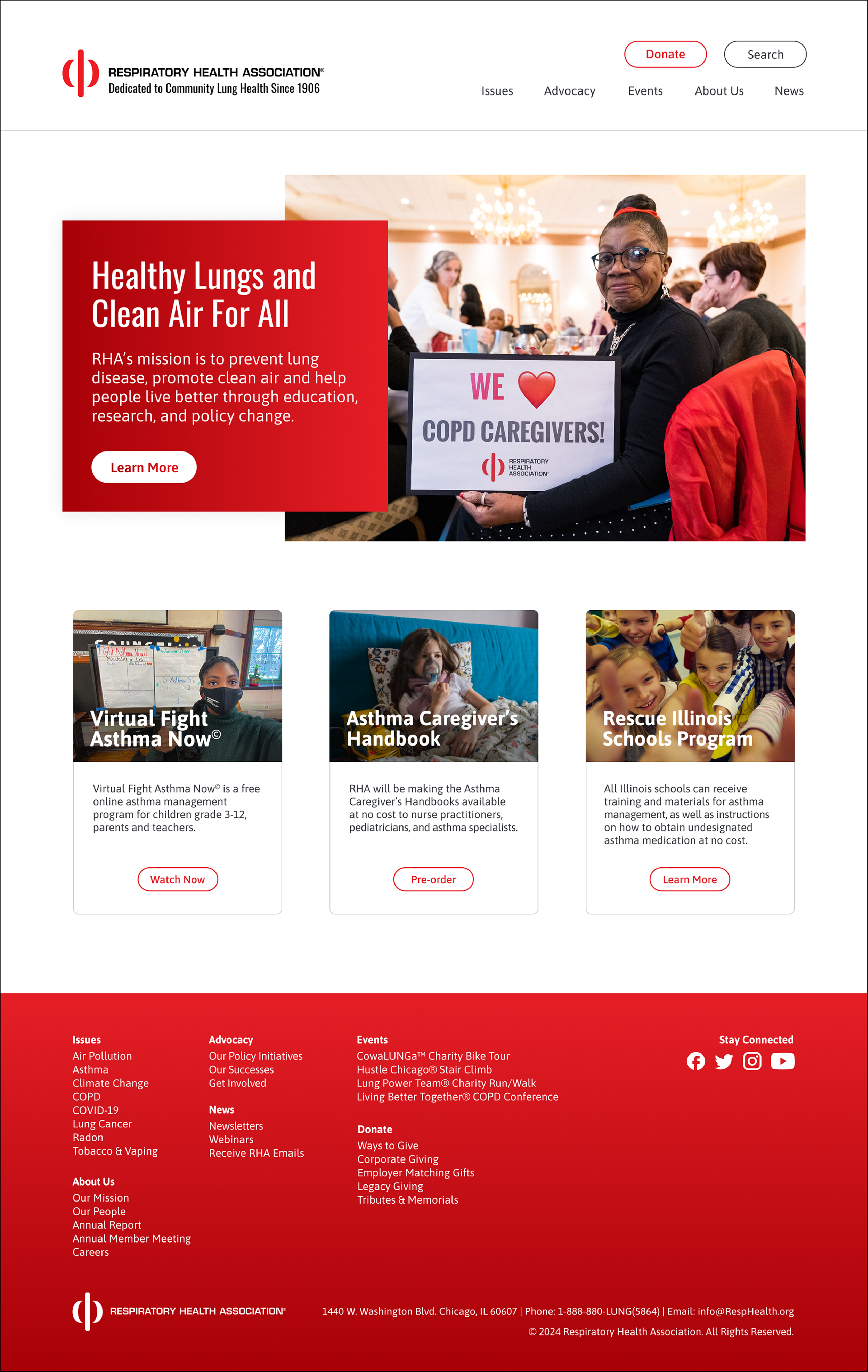
I ended up presenting 4 different designs to staff (below). I tried to give a variety of options for header image style, footer style, button shape, menu layout, size and shape of cards, and photography usage.
Option 1: round outlined buttons, double menu, separate title card and header image, subtitles on image cards, outlines on cards, red footer
Option 2: rectangular filled buttons, singular menu, header with gradient, shadow on cards, red subtitles, gray footer
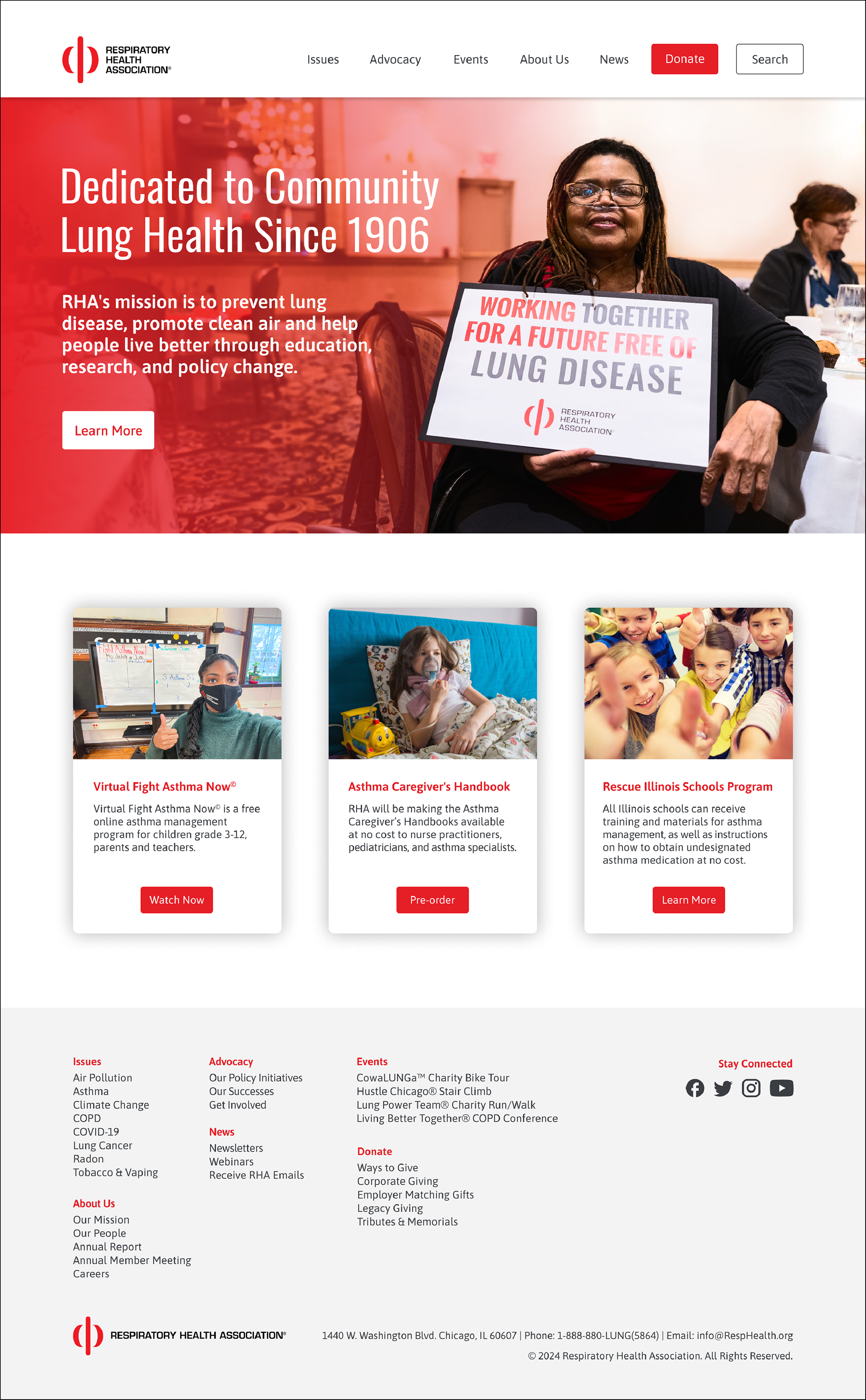
Option 3A: single menu, large header image with text overlay, wide cards that contain multiple quick links, red donate bar, inclusion of teal (secondary brand color)
Option 3B: single menu, large header image with text overlay, wide cards, red container for quick links, large photographs that link to each menu item
After presenting, staff agreed that they were in favor of
• round, outlined buttons
• a separate title card and header image (for ease of updating content)
• gray footer
• shadows on cards
• red donate bar at the bottom
• large images (helps people who are just browsing get a sense of what RHA is all about)
Based on this feedback, I combined the desired elements into the chosen design (below). Since the new design launched in October 2024, the RHA website has seen a 75% increase in page views compared to the previous 6 months.
Figma Prototype
Explore the app by clicking through the different pages and dragging to scroll down. Click on the arrows in the right hand corner to expand the prototype.