Project Type – Print, Merchandise, Digital, Signage
Role – Graphic Designer, Copywriters: Alex Rodriguez & Sarah Meyer Hughes
Software – Adobe Illustrator, Adobe InDesign
Skills – Brand Design, Typography
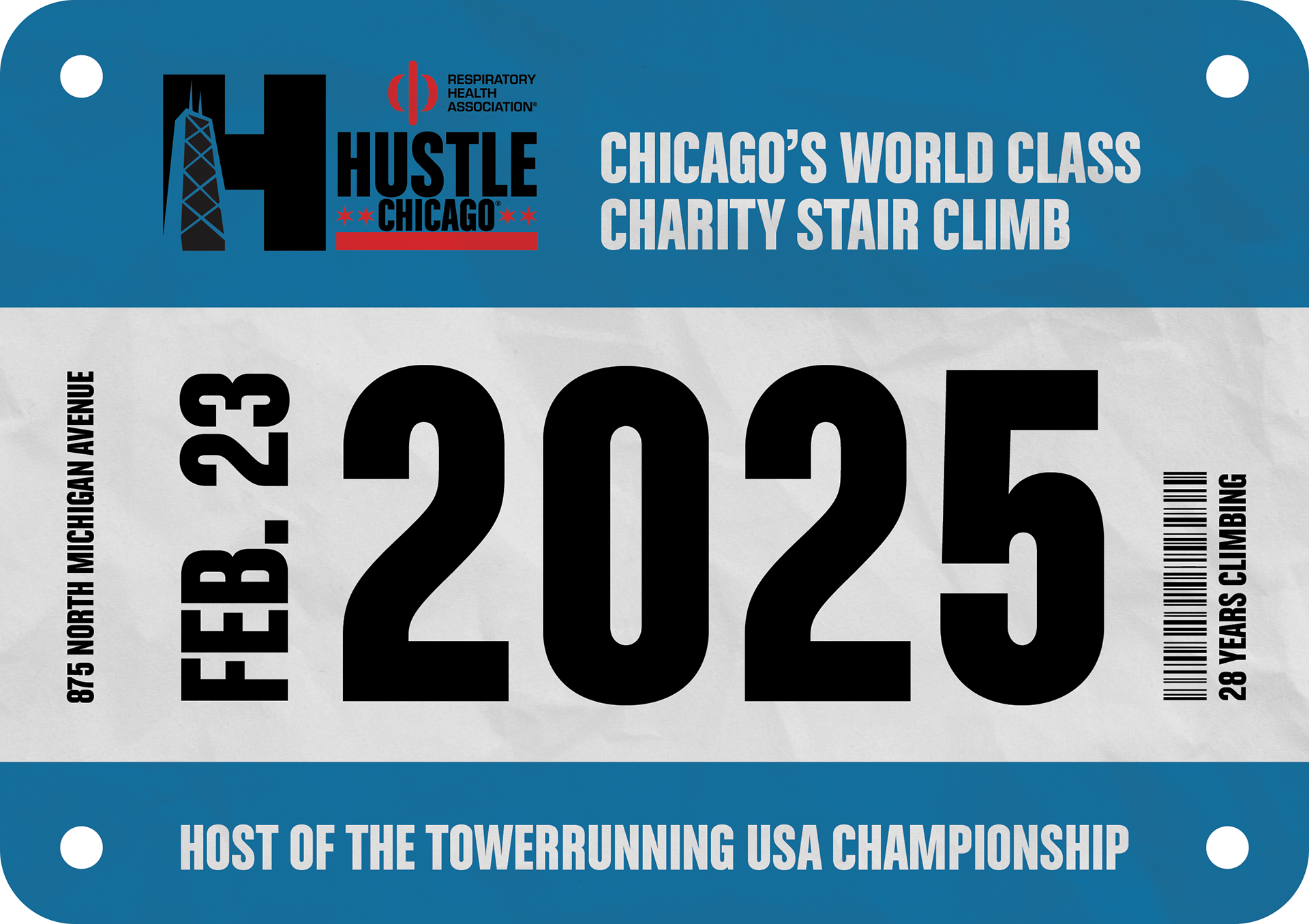
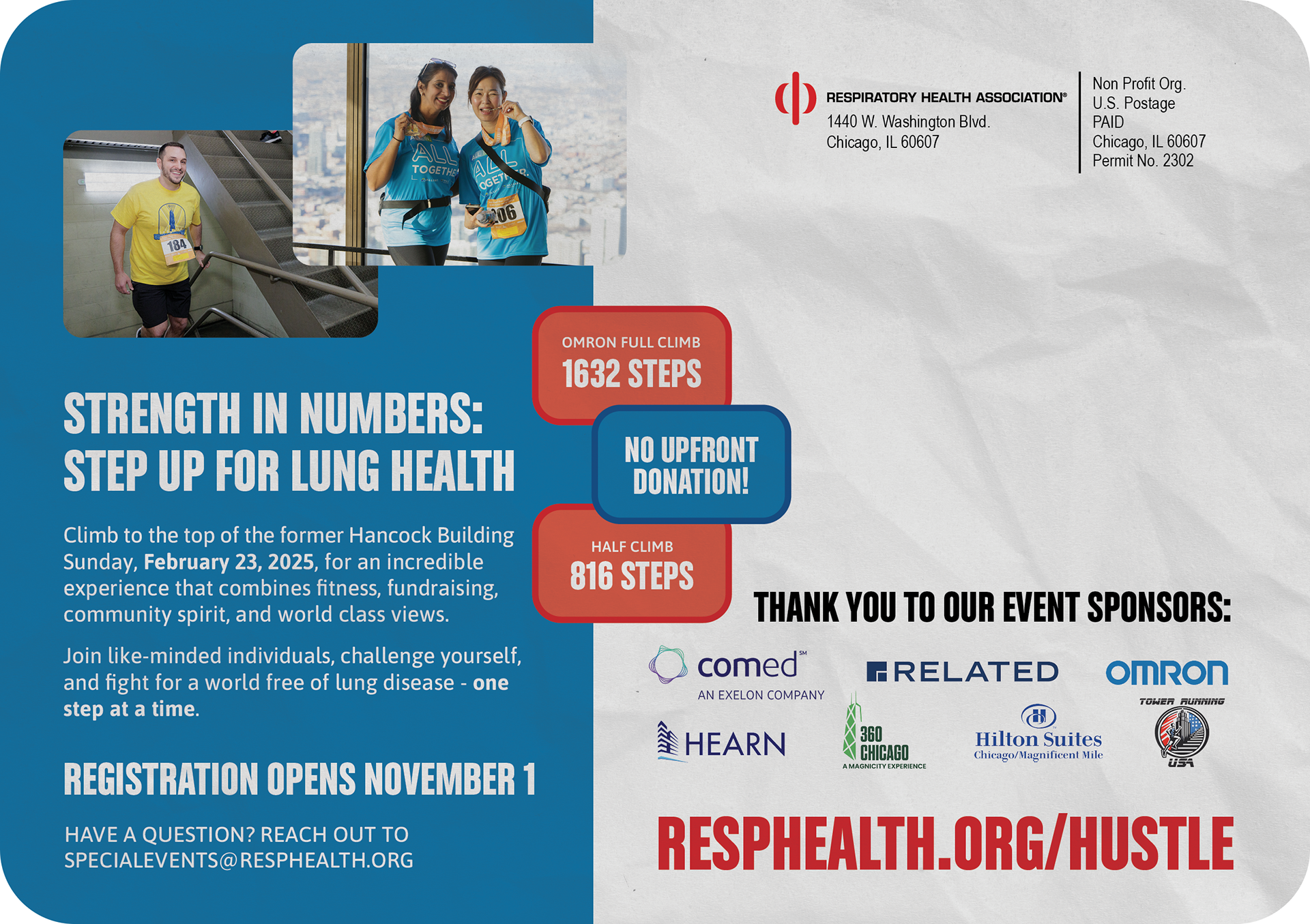
Hustle Chicago® Stair Climb is a yearly fundraising event in which over 2000 participants climb 1632 steps to the top of 875 North Michigan Avenue, the former Hancock Building. The event raises funds for Respiratory Health Association’s programs, which support people living with lung disease and promote clean air.
The theme for 2025 was, "Strength in Numbers: Step Up for Lung Health". I wanted to highlight different statistics or numbers that represent Hustle Chicago such as number of steps climbed, floors climbed, years the event has been active, average climb time, etc. In 2025, Hustle Chicago also hosted the Towerrunning USA Championship, so I wanted to place emphasis on the athleticism of the event as well.
The biggest challenge of this project was working within the existing palette and branding, while creating enough distinction to separate this year's design from previous ones. While things like the logo and typeface were previously established, I selected the medium blue and red from the Hustle Chicago palette, a combination that had not been used in recent years. When appropriate, I also opted to left align the logo type, even out the sizing, and make the stars the focal element rather than the "H" symbol.
Postcard
Postcard Front
Postcard Back
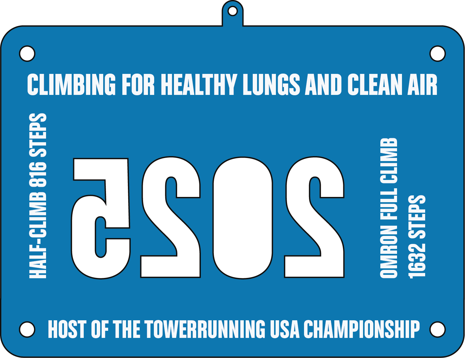
One of the first assets I created was the registration postcard. I decided to take inspiration from the racing bibs participants wear during the climb and model the postcard after one. After doing some research, I found that most bibs have blocks of color at the top and bottom, a white middle section, and black, bold text so that the identification number is not obscured in any way. I kept the color blocking at the top and bottom of the postcard and replaced the identification number with the event's year. I also added rounded corners and circles to look like the holes participants use to pin the bibs to their shirts. Initially, I hoped to punch out the holes on the postcard, but due to postal service restrictions, we needed to opt for faux holes instead. Additionally, I noticed that many racing bibs had vertical text and barcodes, so I used vertical space to fit in additional event information such as the location and anniversary number. Because I wanted this to feel like an actual bib, I also placed a paper texture over the design so that it felt like the bib had been used and became wrinkled from climbing.
Medal

Medal Front
Medal Back

Medal Ribbon

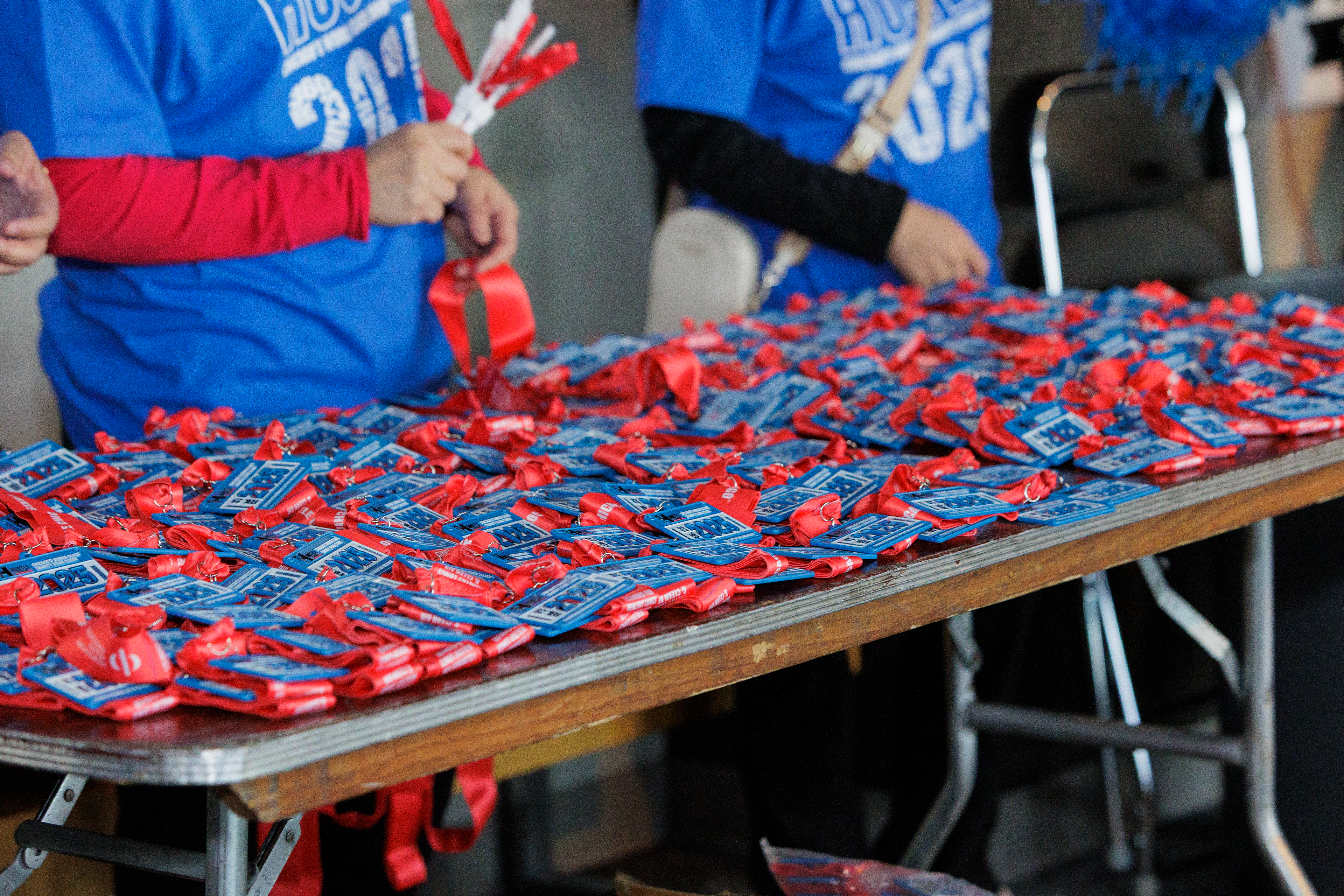
Taking inspiration from the postcard, I decided to model the participant medal after a racing bib as well. While participants may not hold onto their actual bib as it may become dirty or torn, the medal serves as a solid keepsake. The front of the medal is largely the same as the postcard. Some details were removed due to space constraints on the smaller item. The medal also allowed cutouts, so I decided to punch out the year and the corner holes as well. The negative space is a fun detail and places further emphasis on the year. Many Hustle participants are returning climbers, so by placing prominence on the year, this helps them quickly identify the medal when viewing their collection. To keep with the theme of numbers, I added the full and half climb step amounts to the back.
T-Shirt
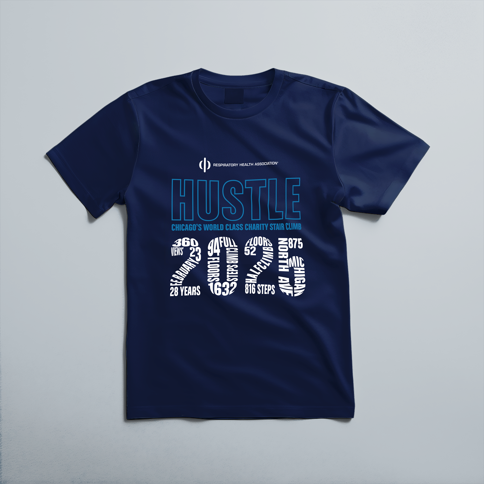

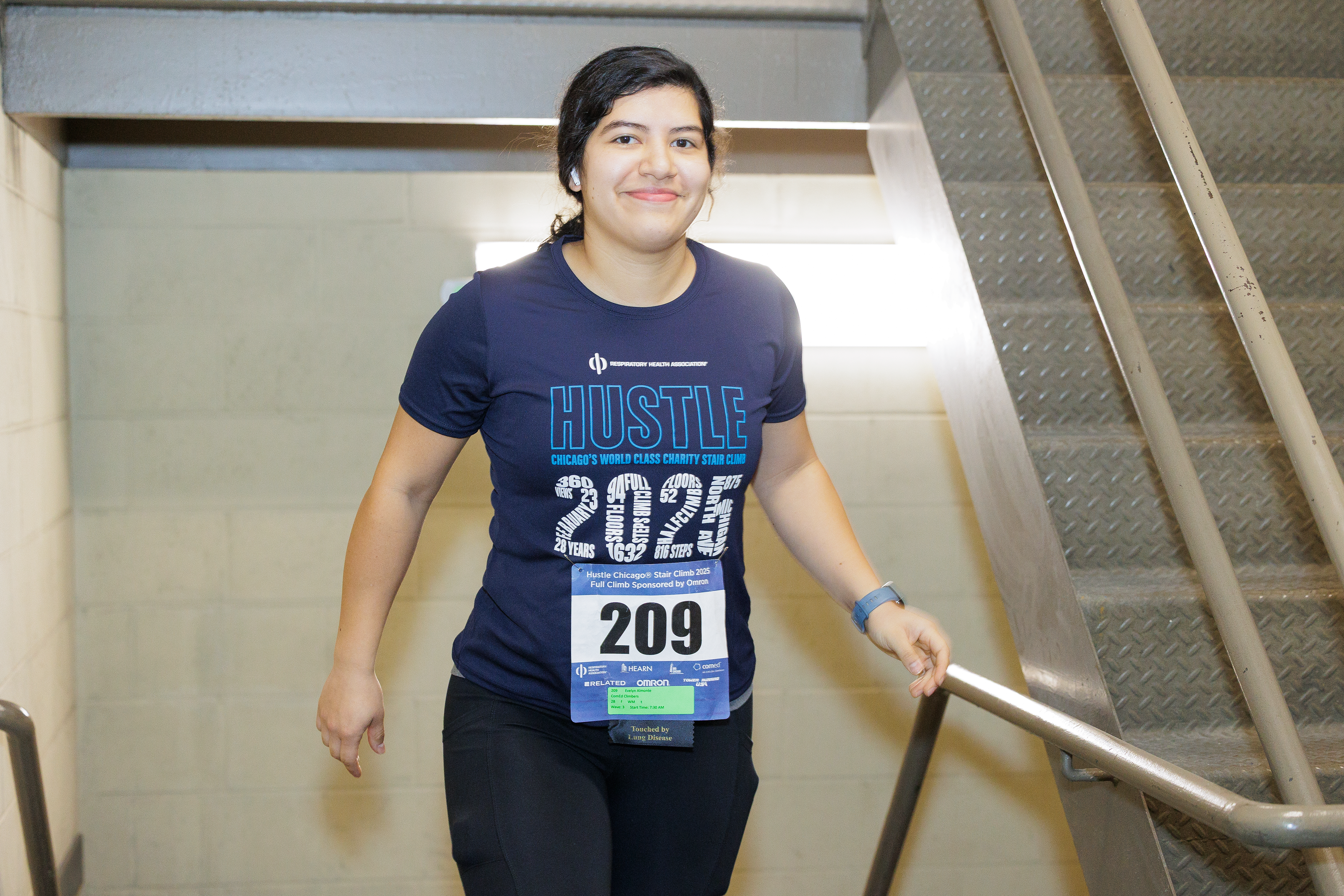
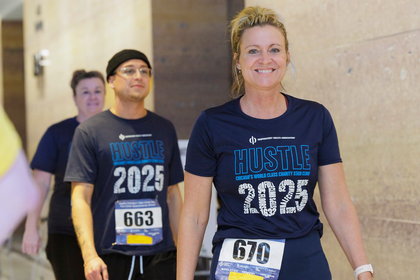
To create variation and avoid placing the racing bib design on a t-shirt that would have the actual climber's bib pinned onto it, I decided to come up with a complimentary design for the event t-shirt. To keep focus on this year's theme and relate back to the emphasis on the year on the postcard and medal, I decided to manipulate the different statistics so that they formed the numbers that represent 2025. I took special care to ensure that the statistics were easy to read close up and the text read clearly as "2025" from a distance. While I originally intended for the design to be placed on a black t-shirt, lack of inventory required us to use a navy shirt instead.
Window Cling
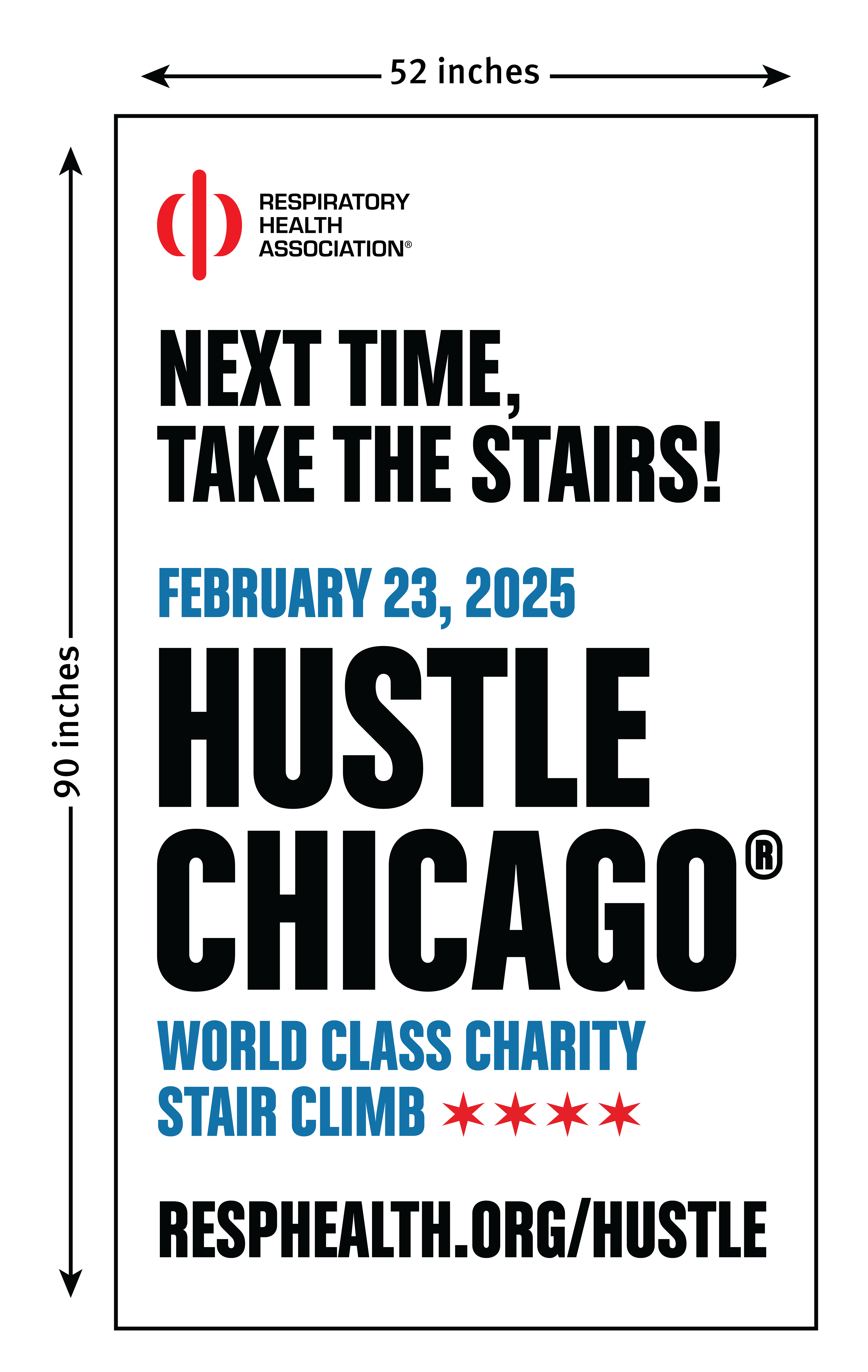
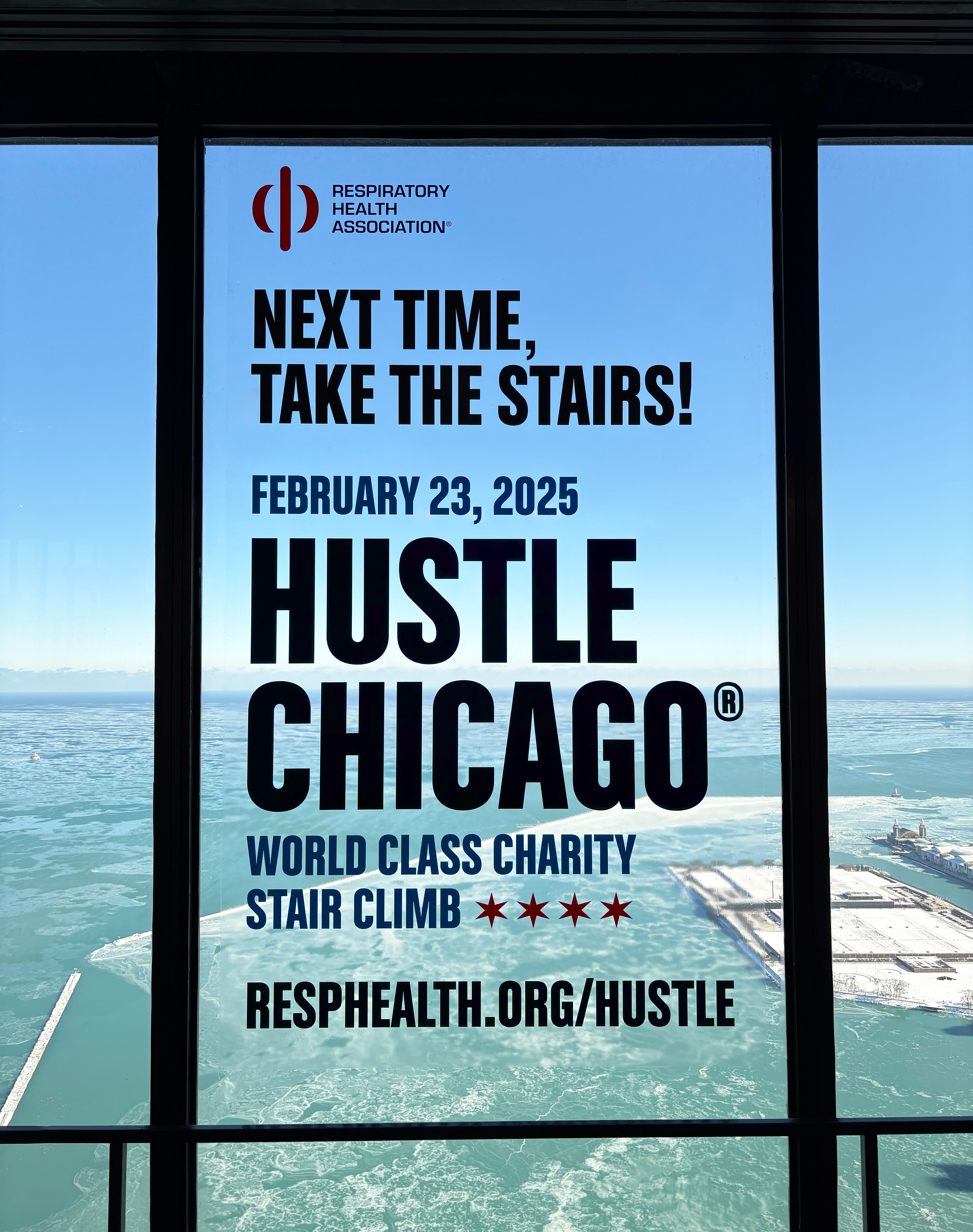

As a fun, promotional piece, RHA was approved to hang a window cling at 360 Chicago Observation Deck, the end point of Hustle Chicago. I wanted to keep the design clean and legible since the view of Lake Michigan would be the backdrop. I decided to use black text for the greatest contrast against the window and then used the blue and red as accent colors. To more appropriately fill the vertical space and better relate the subtext to the event name, I chose to left align the logo mark and carry over the stars from the original logo, rather than the "H" symbol.